
Choosing Paint Colours: Why Your Room Looks Different at Home Than It Did on the Colour Card
Choosing paint colours sounds simple until the colour card comes home.
In the shop, the shade may look soft, warm and elegant. However, once it is on your wall, it can suddenly look too grey, too yellow, too cold, too dark, too pink or nothing like you imagined.
You are not imagining it.
Paint colours change because your home changes them. Natural light, room direction, flooring, furniture, shadows, ceiling height, artificial lighting and neighbouring rooms all affect how a colour looks once it leaves the colour card.
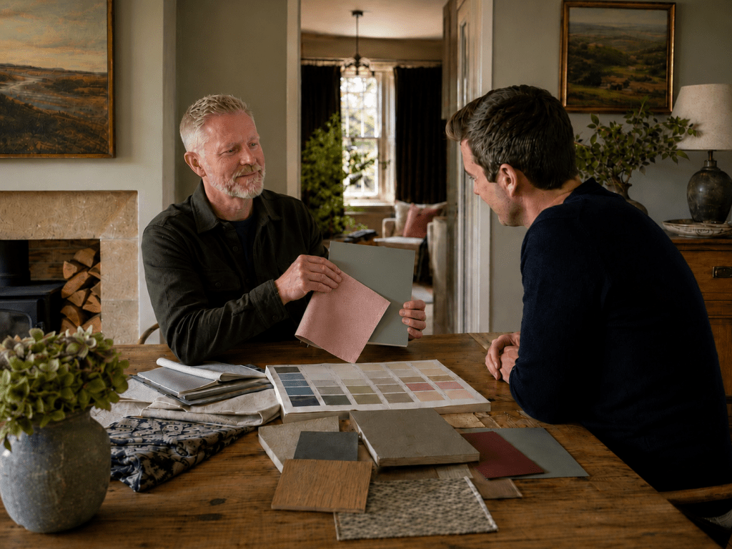
At Turner & Wood in Yeadon, Simon helps customers from Yeadon, Guiseley, Otley, Ilkley, Baildon, Bramhope, Horsforth, Adel, Roundhay, Shipley, Leeds and Bradford solve exactly this problem.
A colour consultation is not about telling you what you “should” like. Instead, it is about helping you make confident choices before you spend money on paint, decorators, furniture and finishes.
Why choosing paint colours feels so difficult
Choosing paint colours feels difficult because most people judge colour in isolation.
They look at one colour on a card and ask, “Do I like this?”
However, a better question is:
Will this colour work in my room, with my light, my flooring, my furniture and the mood I want?
That shift matters.
A warm neutral can look calm in one house and peachy in another. Similarly, a soft green can feel elegant in a bright kitchen but dull in a shaded hallway. Even a beautiful off-white can look fresh in a south-facing room and slightly grey in a north-facing one.
That is why professional colour advice focuses on the whole setting, not just the paint name.
Why paint colours look different at home
Paint looks different at home because colour reacts to light.
A room with cool northern light will often make colours appear sharper, greyer or colder. By contrast, a sunny south-facing room can make colours look warmer, brighter and sometimes more intense.
East-facing and west-facing rooms create another challenge. These spaces change throughout the day, so the same colour can feel different in the morning, afternoon and evening.
This is where many expensive decorating mistakes begin.
People choose a colour from a beautifully lit photograph, then use it in a completely different room. The colour itself may be lovely. However, it may simply be wrong for that space.
Choosing paint colours for north-facing rooms
North-facing rooms often need more warmth, depth or confidence.
The common mistake is trying to make a dark north-facing room look bright white. In reality, a cold white can make the room feel flatter, greyer and less welcoming.
Instead, there are usually two stronger routes.
Option one: warm the room up
Warm neutrals, soft plaster tones, muted pink-beiges, gentle stone shades, creamy whites and warm greys can help balance cooler light.
This approach works well when you want the room to feel calm, relaxed and inviting. It can also help soften spaces with grey flooring, cool tiles or limited natural light.
Option two: lean into the mood
Sometimes, the best answer is not to fight the room.
A north-facing snug, dining room, bedroom or study can look beautiful in a deeper colour. Rich blues, smoky greens, warm browns, earthy reds or deep neutrals can turn a difficult room into a deliberate, atmospheric space.
This is often where brands like Farrow & Ball, Little Greene and Paint & Paper Library become useful, because their more nuanced colours can create depth rather than simply looking dark.
Choosing paint colours for south-facing rooms
South-facing rooms usually receive warmer, brighter light.
That sounds easy. However, it creates its own problems.
A colour that looks soft on a card may become much stronger in full sun. Warm whites can look creamier, yellow undertones can become more obvious, and some pale neutrals can feel washed out in bright daylight.
Therefore, when choosing paint colours for south-facing rooms, it helps to look for balance rather than brightness alone.
Simon will often consider:
- Softer neutrals that do not turn too yellow
- Fresh but not icy off-whites
- Muted greens and blues that can handle warmth
- Earthy shades that still feel balanced in stronger daylight
- Deeper accents that stop the room feeling bland
The goal is not just to choose a pretty colour. More importantly, the goal is to choose a colour that still looks good when the room is flooded with light.
How to fix a room that feels cold
A room can feel cold for several reasons.
It might face north. Alternatively, it might have grey flooring, cool artificial lighting, chrome fittings, black furniture, blue undertones or bright white woodwork.
Before repainting, look at the full picture.
A warmer wall colour may help. However, so might changing the trim colour, softening the ceiling, adding warmer lamps, choosing a warmer neutral, introducing timber, or using a more enveloping colour scheme.
This is where a home colour consultation becomes useful. Simon can look at the room as a whole, not just the wall colour.
How to fix a room that feels dark
A dark room does not always need white paint.
This sounds backwards, but it is often true.
If a room has very little natural light, brilliant white can look dull because there is not enough light for it to bounce around. Instead, a carefully chosen warm neutral, muted mid-tone or deeper cocooning shade can make the room feel more designed and comfortable.
A dark room usually needs decisions on:
- Wall colour
- Ceiling colour
- Woodwork colour
- Lighting temperature
- Flooring undertones
- Curtain or blind colour
- Contrast levels
- Whether to brighten the space or embrace it
As a result, the right answer depends on the room, not a generic colour trend.
How to coordinate colours in an open-plan space
Open-plan spaces cause a different kind of colour problem.
The kitchen, dining area and living space may all be visible at once. Therefore, each colour has to work with the next one.
If the kitchen cabinets, island, walls, flooring and soft furnishings all fight each other, the whole space can feel unsettled.
A good open-plan scheme usually needs a controlled palette. For example, that might include:
- One main wall colour
- One supporting neutral
- One cabinetry or island colour
- One stronger accent
- A consistent trim or ceiling approach
- Repeated undertones across connected areas
The trick is to create flow without making every area feel identical.
For instance, a warm neutral through the main space might connect beautifully with a deeper green island, a softer off-white ceiling and a bolder colour in a snug or dining corner.
Why undertones matter when choosing paint colours
Colour names can be misleading.
A shade called “stone” might lean pink, green, yellow or grey. Likewise, a “white” might be warm, cool, creamy, chalky or sharp. Even a “grey” might carry blue, violet, green or beige undertones.
This matters because undertones either harmonise or clash with what is already in the room.
Common undertone clashes include:
| Existing feature | Colour mistake to avoid |
|---|---|
| Grey flooring | Choosing a beige that turns muddy beside it |
| Cream kitchen units | Choosing a cool white that makes the units look yellow |
| Red-toned timber | Choosing a wall colour that exaggerates orange tones |
| Blue-grey sofa | Choosing a warm wall colour that makes the sofa look colder |
| Brass fittings | Choosing colours that feel too stark or clinical |
| Black worktops | Choosing pale walls with too much contrast and no warmth |
For this reason, customers often come into Turner & Wood with photos. Once Simon can see the flooring, furniture and light, the colour conversation becomes much more accurate.
Are premium paint colours worth it?
Premium paint colours can be worth it when the colour itself solves the design problem.
Brands such as Farrow & Ball, Little Greene and Paint & Paper Library are often chosen because customers want more than a basic white, grey or beige. They want nuance, depth, atmosphere and a particular feeling.
However, the brand alone does not guarantee success.
A premium colour in the wrong room can still look wrong. Therefore, colour advice matters.
The best result comes from matching the colour to the room, the finish, the lighting and the wider scheme.
At Turner & Wood, the conversation is practical as well as design-led. Sometimes the right answer is a premium brand. Sometimes it is a colour-matched option. In other situations, it may be a more durable Johnstone’s finish in a carefully chosen colour.
Ultimately, the aim is always to get the right colour and the right product for the job.
How a colour consultation helps avoid costly mistakes
A decorating mistake can become expensive quickly.
You may pay for tester pots, paint, sundries and a decorator, only to realise the colour feels wrong once the room is finished. In a larger space, that mistake can cost far more than the consultation would have done.
A colour consultation helps you avoid:
- Choosing colours that look wrong in your light
- Picking whites that clash with kitchens or flooring
- Making north-facing rooms feel colder
- Making south-facing rooms feel too yellow or bright
- Creating open-plan schemes that do not flow
- Choosing colours from online images without context
- Buying premium paint in the wrong shade
- Repainting because the first choice failed
In short, a good consultation narrows the choices, explains the reasoning and gives you a scheme you can move forward with confidently.
What happens during a Turner & Wood colour consultation?
A Turner & Wood colour consultation focuses on how your home actually works.
Simon will usually consider:
- Room direction and natural light
- Existing flooring, furniture and fabrics
- Kitchen units, worktops and tiles
- Woodwork, ceilings and architectural features
- How rooms connect
- Whether the space should feel calm, warm, fresh, bold or cosy
- Practical use of the room
- Paint finish and durability
- Budget and decorating plans
For in-store advice, bring photos in good daylight, wider room shots, close-ups of flooring and any samples you already have.
For a home colour consultation, Simon can see the light, proportions and surrounding rooms properly. Consequently, decisions often become easier, especially for whole-home schemes, open-plan spaces and rooms that have already caused problems.
When should you book a home colour consultation?
You should consider booking a home colour consultation if:
- You keep buying tester pots but still feel unsure
- Your room feels cold, dark or unfinished
- You are decorating more than one room
- You have an open-plan kitchen, dining and living space
- You want a whole-home colour scheme
- You are using premium paint and want to get it right
- You need colours to work with existing flooring or furniture
- You are preparing a house for sale
- You want your home to feel more pulled together
- You lack confidence with bolder colour choices
Rather than leaving you with a pile of maybes, a consultation gives you a clear plan.
Why local colour advice makes a difference
Online inspiration can help, but it cannot see your room.
It cannot see the grey Yorkshire daylight on a wet Tuesday afternoon. It cannot see the stone outside your window, the exact tone of your oak floor, the cream in your kitchen units, or how your hallway flows into your living room.
That local, practical context matters.
Turner & Wood works with customers across Yeadon, Guiseley, Otley, Ilkley, Baildon, Bramhope, Horsforth, Adel, Roundhay, Shipley, Leeds and Bradford, helping them choose colours that suit real homes, real light and real budgets.
As a result, the final scheme feels more considered, more comfortable and more personal.
The Turner & Wood view on choosing paint colours
If you are struggling with choosing paint colours, do not keep guessing.
Start with the room.
Look at the light, the direction, the flooring, the furniture, the undertones and the feeling you want to create. Then choose the colour.
Simon Long at Turner & Wood can help you move from uncertainty to a clear, workable scheme, whether you need quick in-store advice or a more detailed home colour consultation.
Bring your photos into the shop, call Turner & Wood, or book a consultation if you want help creating a colour scheme that works properly before the paint goes on the wall.
Good colour choices do not happen by accident. They happen when experience, light, undertones and your home all come together.
FAQ section
Why is choosing paint colours so hard?
Choosing paint colours is difficult because colours change depending on light, room direction, flooring, furniture, artificial lighting and neighbouring colours. A colour that looks perfect on a card may behave very differently once it is painted on your wall.
What colour is best for a north-facing room?
North-facing rooms often suit warmer neutrals, soft plaster tones, muted earthy shades or deeper cocooning colours. However, the best choice depends on whether you want to warm the room up or lean into a moodier, more atmospheric feel.
What colour is best for a south-facing room?
South-facing rooms can take many colours, but strong sunlight can make warm shades look more yellow or intense. Therefore, softer neutrals, balanced off-whites, muted greens, gentle blues and earthy shades often work well.
Can Turner & Wood help me choose Farrow & Ball colours?
Yes. Turner & Wood can help you choose Farrow & Ball colours, as well as Little Greene, Paint & Paper Library, Johnstone’s and colour-matched options depending on your room, budget and finish requirements.
Do I need a colour consultation for one room?
A colour consultation can be useful even for one room if the space feels difficult, dark, cold, awkwardly lit or connected to other areas. It can also save money by helping you avoid the wrong colour choice.
What should I bring for in-store colour advice?
Bring clear photos of the room in daylight, wider shots of the space, close-ups of flooring, furniture, curtains, tiles, kitchen units and any colours or samples you already like.
Can a colour consultation help with open-plan spaces?
Yes. Open-plan spaces often need a coordinated palette so the kitchen, dining and living areas flow without looking flat or mismatched. A consultation helps create that connection.
Can Simon help with a whole-home colour scheme?
Yes. Simon can help create a whole-home colour scheme that links rooms together while still giving each space its own character. This is especially useful during renovations or larger decorating projects.
Is a home colour consultation better than choosing colours online?
Online inspiration can be helpful. However, it cannot judge your actual light, flooring, furniture or room proportions. A home colour consultation gives advice based on your real space.
How do I book a colour consultation near Leeds or Bradford?
Contact Turner & Wood in Yeadon to arrange colour advice with Simon Long. Turner & Wood helps customers from Yeadon, Guiseley, Otley, Ilkley, Baildon, Bramhope, Horsforth, Adel, Roundhay, Shipley, Leeds and Bradford.
choosing paint colours, farrow and ball, Little greene, paint and paper library

