
The New Warm Neutrals: How to Choose Soft, Sophisticated Paint Colours for a Calmer Home
Warm neutral paint colours are becoming one of the biggest shifts in UK interiors, especially for homeowners who want rooms that feel softer, calmer and more welcoming than the cool grey schemes of the past.
For years, grey was the default choice for anyone wanting something modern, clean and safe. Recently, however, the mood has changed. More homeowners are moving towards warm neutrals with depth, undertone and texture.
These are not old-fashioned beiges, yellow-heavy creams or anything close to magnolia. Instead, the new warm neutrals are far more refined. Think clay, stone, mushroom, linen, chalk, taupe and soft plaster tones.
Together, these colours create rooms that feel elegant, comfortable and quietly luxurious without looking flat or dated.
At Turner & Wood in Yeadon, we are seeing more customers from Guiseley, Otley, Ilkley, Baildon, Bramhope, Horsforth, Adel, Roundhay, Shipley, Leeds and Bradford ask for neutral colour schemes that feel warmer, more personal and more considered.
That does not mean every room has to be beige. It means choosing neutrals that work with your home’s light, flooring, furniture and architecture.
What are warm neutral paint colours?
Warm neutral paint colours are soft, balanced shades that sit between white, cream, beige, stone, taupe, greige, mushroom and plaster.
Usually, they contain gentle warm undertones such as red, yellow, brown, clay, pink, ochre or muted green. Because of this, they tend to feel softer and more natural than cooler greys or stark whites.
The best warm neutrals do not shout. Instead, they support the rest of the room.
They work beautifully with natural materials such as oak, limestone, wool, linen, ceramic, leather, brass and aged bronze. As a result, they are especially useful in real homes, particularly kitchens, bedrooms, hallways and open-plan family spaces.
Why are warm neutral paint colours replacing cool grey?
Cool greys can still look beautiful in the right space. However, many homeowners have found that grey can feel cold, flat or slightly lifeless in certain UK homes.
This is especially true in north-facing rooms, older properties, shaded hallways and spaces with cool artificial lighting.
Warm neutral paint colours feel more liveable because they add softness without becoming overpowering. They can make a room feel calmer, more welcoming and more connected to natural materials.
In other words, people still want sophistication, but they also want rooms that feel like home.
Why warm neutrals feel more luxurious
Warm neutrals often feel luxurious because they create quiet depth.
They allow natural materials to stand out, artwork to feel richer, lighting to feel softer and architectural details to breathe. At the same time, they help furniture and fabrics feel more layered, while making open-plan spaces feel calmer and more connected.
The key is pigment balance.
Premium paint brands such as Farrow & Ball, Little Greene and Paint & Paper Library are particularly strong in this area because many of their neutrals have subtle undertones rather than a flat, one-dimensional look.
That matters because a warm neutral can change throughout the day. Morning light, afternoon light and warm evening lamps can all bring out different qualities in the same colour.
Therefore, the best warm neutral is not simply the shade that looks nice on a colour card. It is the one that works with your room, your light and your materials.
Best warm neutral paint colours from Farrow & Ball, Little Greene and Paint & Paper Library
Every home is different. However, a few colours consistently come up in premium UK interiors because they are flexible, elegant and easy to build schemes around.
Below are three strong examples we often discuss with customers looking for softer, warmer neutral schemes.
Little Greene French Grey: a warm grey-green neutral
Little Greene French Grey is one of the most versatile warm grey-green neutrals available. Little Greene describes French Grey as a classic period colour mixed with blue and red for a warm neutral shade of grey, which explains why it feels softer than many cooler contemporary greys.
Because of that balanced undertone, French Grey can work beautifully on walls, cabinetry, panelling and woodwork, especially when paired with natural materials.
It is particularly effective in kitchens, hallways, utility rooms, boot rooms, shaker cabinetry and panelling.
French Grey also pairs well with warm oak, limestone, aged brass, natural linen, soft ivory and deep green accents.
Importantly, French Grey is a good example of why undertone matters. It is not just “grey”. It has enough warmth and complexity to feel softer in real homes.
Farrow & Ball Drop Cloth: a relaxed warm neutral
Farrow & Ball Drop Cloth is a relaxed, understated warm neutral that sits somewhere between stone, taupe and warm greige. Farrow & Ball describes it as neither too yellow nor too grey, which makes it particularly useful for customers who want warmth without obvious creaminess.
In practice, Drop Cloth can work well in family kitchens, open-plan living spaces, boot rooms, relaxed sitting rooms, utility rooms and period properties.
It also pairs beautifully with darker earthy accents such as olive green, chocolate brown, bronze, aged brass and deep charcoal.
This is the sort of shade that can make a room feel designed without making the wall colour the loudest part of the scheme.
Paint & Paper Library Stone: soft architectural warmth
Paint & Paper Library Stone is part of the brand’s Architectural Colours collection. Paint & Paper Library explains that these colours are formulated in different strengths of the same pigments to create subtle shade differentiations within an interior.
That makes Stone especially useful when you want a layered neutral scheme that feels calm, tonal and refined.
It can work well in bedrooms, snug living rooms, north-facing rooms needing softness, calm hallways and open-plan spaces where you want the colours to flow rather than fight.
It is also a good choice when a room needs warmth, but not obvious yellowness.
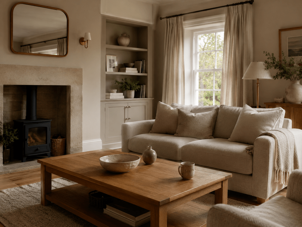
How to stop warm neutral rooms looking bland
The biggest fear with neutral decorating is that the room will feel boring.
Usually, that happens when everything is too similar, too flat or too safe.
A successful warm neutral room needs contrast, texture and rhythm. You can create that with darker timber furniture, brushed brass, aged bronze, linen curtains, wool rugs, boucle upholstery, handmade ceramics, natural stone, subtle black details and tonal woodwork.
The trick is not harsh contrast. Instead, it is about adding enough variation to give the room shape.
For example, you might use warm stone walls with a slightly deeper mushroom shade on cabinetry, soft ivory on the ceiling, aged brass handles, oak flooring, linen curtains and muted green or terracotta accents.
That type of palette feels calm, but not empty.
Should woodwork still be brilliant white with warm neutral walls?
One of the biggest shifts in premium interiors is the move away from bright white woodwork.
Brilliant white can still be useful. However, against warmer walls, it can sometimes create a contrast that feels too sharp.
Softer trim colours often look more expensive and considered.
Instead of bright white, you might choose soft ivory, warm white, pale stone, muted taupe, a slightly lighter version of the wall colour, or a deeper complementary neutral.
This approach is especially effective in period homes, where softer woodwork can make cornices, skirting boards, doors and architraves feel more integrated.
Why tonal decorating works with warm neutral paint colours
Tonal decorating means using closely related colours rather than one wall colour and one bright white trim.
For example, you might use a warm neutral on the walls, a soft white or paler neutral on the ceiling, a related shade on the woodwork, and a slightly deeper tone on cabinetry. Then, to add interest, you can bring in earthy green, rust, brown or muted blue accents.
This approach works particularly well in period properties, luxury apartments, modern extensions, open-plan homes, hallways, landings, bedrooms and snugs.
Tonal schemes also tend to age well because they do not rely on one obvious trend colour. Instead, they create atmosphere through balance.
How lighting changes warm neutral paint colours
Lighting changes everything.
A warm neutral that looks perfect in the shop can behave very differently at home. This does not mean the colour is wrong. It simply means colour is always affected by light and surrounding materials.
Before choosing a neutral, consider whether the room is north-facing or south-facing. Also think about whether it gets strong sunlight, whether it is shaded by trees or neighbouring buildings, and what colour the flooring is.
Artificial light matters too. Warm bulbs, cool LEDs, brass fittings, grey flooring, oak furniture and stone worktops can all influence how a neutral appears.
A shade that looks beautifully balanced in a south-facing room may lean pink, yellow or flat in another space.
That is why we recommend testing warm neutrals on large sample boards and moving them around the room.
View them in the morning, afternoon and evening. In addition, place them next to flooring, fabrics, cabinetry and under artificial light.
This simple step can prevent expensive decorating mistakes.
Best warm neutral paint colours for north-facing rooms
North-facing rooms often have cooler, bluer light. As a result, some neutrals can look colder than expected.
In these rooms, warmer neutrals can be extremely helpful.
Look for shades with hints of stone, clay, plaster, mushroom, taupe, warm grey-green, soft beige or gentle ochre.
However, avoid choosing a colour only because it looks bright on a card. In a north-facing room, a very pale cool neutral can sometimes feel colder than a slightly deeper warm shade.
This is where a colour consultation can save a lot of guesswork. Simon can help you decide whether the room needs lifting, warming, softening or embracing with a richer tone.
Best warm neutral paint colours for south-facing rooms
South-facing rooms usually receive warmer, brighter light.
That can make creamy colours, yellow-based neutrals and warm beiges look stronger than expected. Therefore, these spaces often need a more balanced neutral.
Good options can include soft greige, warm stone, muted taupe, grey-green neutrals, chalky beige and off-whites that are not too yellow.
The aim is not to remove warmth. It is to control it.
A south-facing kitchen in Otley, a bright sitting room in Ilkley or a sunny extension in Horsforth may need a different neutral from a shaded hallway in Yeadon.
Warm neutral kitchen colours
Warm neutrals are particularly good in kitchens because they work well with practical materials.
They can soften stone worktops, oak flooring, brass handles, painted cabinetry, ceramic tiles, natural fabrics and open shelving.
A warm neutral kitchen does not have to mean plain walls. For example, you can use a soft neutral on the walls, a deeper mushroom tone on cabinetry and a gentle warm white on the ceiling.
This gives the kitchen depth without making it feel dark.
Warm neutrals also work well with earthy accent colours such as olive green, muted terracotta, deep brown, bronze and soft black.
Warm neutral bedroom colours
Bedrooms are where warm neutrals really shine.
They create calm without feeling empty.
For a restful bedroom, consider soft stone walls, linen-toned curtains, a warm white ceiling, oak or walnut furniture, wool bedding and muted plaster or taupe accents.
However, avoid making the whole room too pale and flat. A slightly deeper neutral behind the bed can create a more cocooning, hotel-like feel without needing a dramatic feature wall.
Warm neutral colour schemes for open-plan spaces
Open-plan spaces need flow.
One safe neutral across everything can feel easy, but it can also make the whole space feel bland. On the other hand, too many colours can make the space feel chopped up.
Warm neutrals work best when used as a connected palette.
For example, you might use a main warm neutral across the open-plan space, a deeper tone in the dining zone, a softer ceiling shade, a related woodwork or cabinetry colour, and earthy accents through furniture, lighting or artwork.
For open-plan homes in Baildon, Bramhope, Shipley, Leeds and Bradford, this is often where proper colour advice makes the biggest difference. These spaces involve more paint, more visible sightlines and more opportunity for colours to clash.
When warm neutral paint colours are not the answer
Warm neutrals are versatile, but they are not always the right choice.
They may not be the best route if the room already has very yellow flooring, the lighting is extremely warm, the furniture is mostly cream and beige already, or you want a crisp, gallery-like look.
Equally, some spaces need stronger colour to create identity. In other rooms, the undertone may clash with tiles, carpets or worktops.
This is why choosing from a trend list is risky. The right warm neutral is the one that works with your actual room.
Why visit Turner & Wood before choosing warm neutral paint colours?
Online inspiration is useful. However, it cannot fully show how colour behaves in your home.
At Turner & Wood in Yeadon, we can help you compare premium warm neutrals from Farrow & Ball, Little Greene and Paint & Paper Library, as well as practical options from Johnstone’s Trade where durability, finish or budget matter.
To get the best advice, bring room photos, flooring samples, fabric swatches, wallpaper ideas, cabinet colours, worktop samples, inspiration images and details of the room’s light direction.
With that information, Simon can help you narrow down the right palette before you spend money on paint, labour and materials.
Book a colour consultation for a warm neutral colour scheme
Warm neutrals are not about playing safe. Used well, they create homes that feel calm, comfortable and quietly luxurious.
However, the key is choosing the right undertone for the room.
If you are redesigning one room or planning a whole-home scheme, a colour consultation with Simon at Turner & Wood can help you make confident decisions.
We help homeowners from Yeadon, Guiseley, Otley, Ilkley, Baildon, Bramhope, Horsforth, Adel, Roundhay, Shipley, Leeds and Bradford choose paint colours that work with their light, architecture and lifestyle.
Visit Turner & Wood in Yeadon, call the shop, or ask about booking a colour consultation.
Your home deserves better than guesswork.
FAQ section
What are warm neutral paint colours?
Warm neutral paint colours are soft shades such as stone, clay, taupe, mushroom, linen, warm greige, chalk and plaster. They create calm interiors without feeling stark or cold.
Are warm neutrals replacing grey?
In many UK homes, yes. Cool grey is still useful in the right setting, but many homeowners are now choosing warmer neutrals because they feel softer, more natural and more liveable.
What warm neutral paint colours work well in north-facing rooms?
North-facing rooms often benefit from warm whites, soft stone shades, muted plaster tones, mushroom neutrals, taupe, clay-based neutrals and warm grey-greens.
What warm neutral paint colours work well in south-facing rooms?
South-facing rooms can often handle balanced greige, warm stone, muted taupe, grey-green neutrals, chalky beige and off-whites that are not too yellow.
Is Farrow & Ball Drop Cloth a warm neutral?
Yes. Farrow & Ball Drop Cloth is a relaxed warm neutral that sits between stone, taupe and greige. It is often used in kitchens, open-plan spaces and calm family rooms.
Is Little Greene French Grey warm or cool?
Little Greene French Grey is a soft grey-green neutral with more warmth and complexity than many cooler greys. It can work well in kitchens, hallways, cabinetry and panelling.
How do I stop a neutral room looking boring?
Use texture, contrast and tonal variation. Linen, wool, oak, brass, ceramics, darker timber and related trim colours can all make a warm neutral room feel layered rather than bland.
Should I use brilliant white woodwork with warm neutral walls?
Not always. Softer whites, ivory, pale stone or related neutral trim colours can often look more elegant against warm neutral walls than a very bright white.
Can Turner & Wood help me choose warm neutral paint colours?
Yes. Bring photos, samples and ideas into Turner & Wood in Yeadon, or ask about a colour consultation with Simon for tailored advice.

